
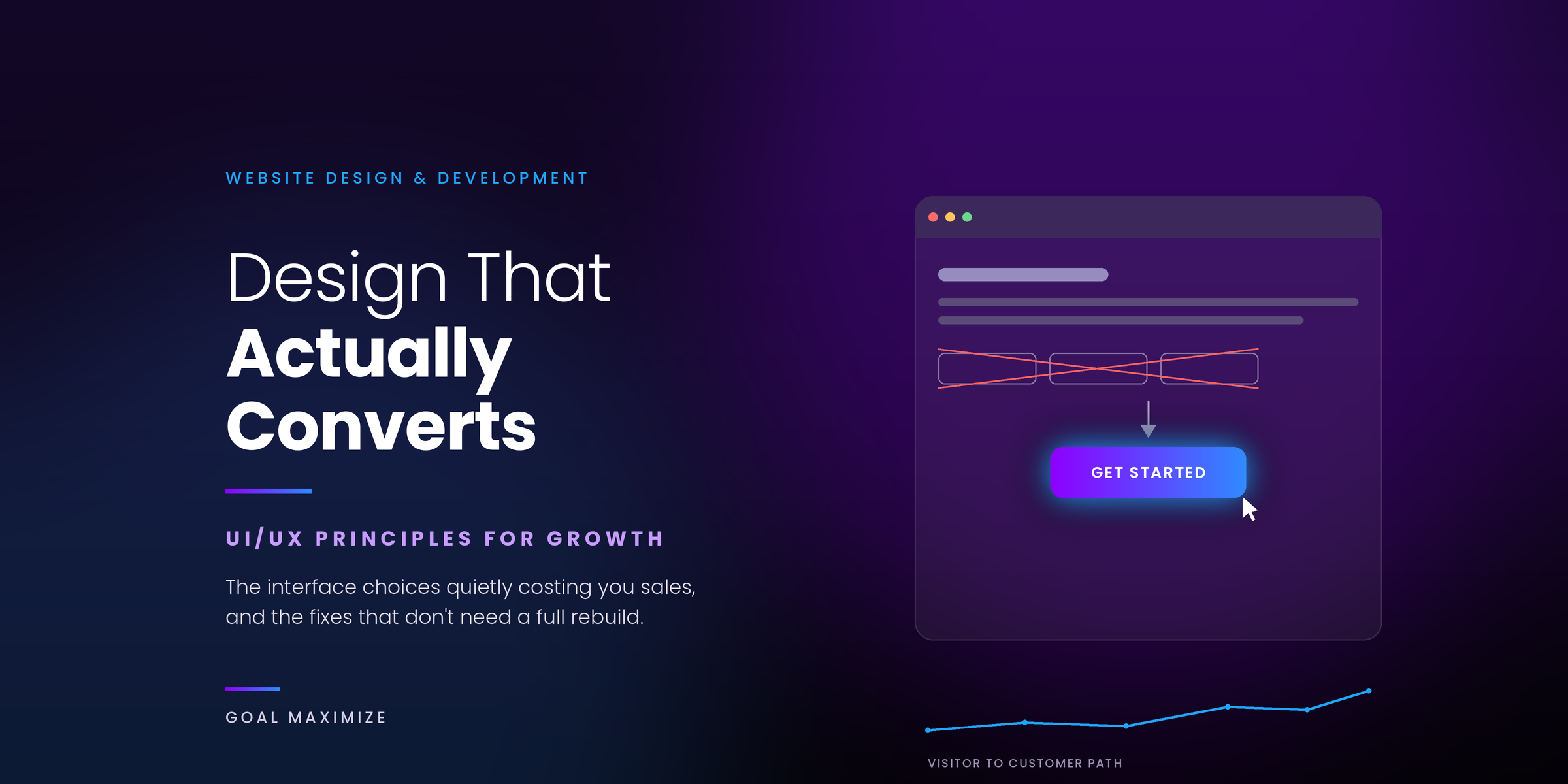
A client came to us convinced his product was the problem. Traffic was solid, ad spend was working, people were landing on the site every day. Almost none of them bought anything. We pulled up the analytics, watched a few session recordings, and within 20 minutes it was obvious the product was fine. The site was fighting the visitor at every step: a homepage with 3 different calls to action arguing for attention, a contact form asking for a job title nobody wanted to type on a phone, and a checkout that took 4.8 seconds to load on mobile before a single product image showed up.
That story is more common than most business owners realize. UI is what a page looks like. UX is what it feels like to actually use it, whether a visitor can find what they need without thinking twice, and whether the site gets out of their way instead of standing in it. Get the product right and get the design wrong, and you still lose the sale. Below is what we’ve learned actually moves conversion numbers, not just what looks nice in a portfolio.
Why design decisions show up on your revenue reports
Design is often treated as the last thing to worry about, something you fix once the “real” marketing is dialed in. That gets it backwards. Studies on usability improvements have documented conversion lifts of up to 400% once basic friction is removed, and speed alone can swing results by a wide margin: a 1-second delay in load time has been shown to cut conversions by as much as 20%. Walmart’s performance team found that every 100 milliseconds they shaved off page speed added roughly 2% to conversions, and that’s Walmart, a company that already had a mature site before they started optimizing.
We treat UI/UX web design as part of the growth strategy for exactly this reason. It’s not decoration sitting on top of your marketing. It’s the thing your marketing budget has to pass through before it turns into a sale. If you want to see the full range of numbers by industry, this breakdown of page speed statistics is worth a read.
Get the visual hierarchy right before anything else
People don’t read websites top to bottom like a page in a book. Eye-tracking studies show most visitors scan in something closer to an F shape or a Z shape: top left first, across the headline, then down the left edge hunting for something worth stopping on. If your value proposition or your main button is buried under a slideshow of stock photos, most people will scroll right past it without ever registering that it existed.
The fix isn’t complicated, but it does require restraint. Make the headline genuinely the biggest, boldest thing on the page. Make the button color stand apart from everything around it instead of blending into your brand palette. And leave space around the things that matter. Crowded pages read as untrustworthy, even if visitors couldn’t tell you why. We run into this constantly during graphic design and layout audits: the offer isn’t the problem; it’s that the offer is competing with 6 other elements for the same 2 seconds of attention. Cut the page down to one clear next step per screen, and conversion tends to move without a single word of copy changing.
Color and type aren’t decoration; they’re instructions
Typography tells people how hard they have to work to read your site. Color tells them how to feel about what they’re reading, whether they realize it or not.
On the typography side, keep it simple: one font for headlines, one for body copy, and resist the urge to add a third “just for accent.” Line length matters more than people think; somewhere around 50 to 75 characters per line reads comfortably; longer than that, and eyes start losing their place. Keep your heading sizes consistent so the page structure feels intentional rather than thrown together section by section.
Color is where a lot of brands overthink things. Blue reads as trustworthy, which is why half the finance and healthcare industry uses it. Orange and red create urgency, which is why they show up on so many “buy now” buttons. None of that is a hard rule, but fighting against it without a reason usually costs conversions rather than helping. The bigger issue we see isn’t color choice; it’s contrast. A button in your exact brand purple might look polished in a mockup, but if it’s close in tone to the background it sits on, it just disappears. Squint at your homepage, or view it in grayscale. If the button doesn’t clearly separate from everything around it, people are scrolling right past it.
Speed is a design decision, not an IT ticket
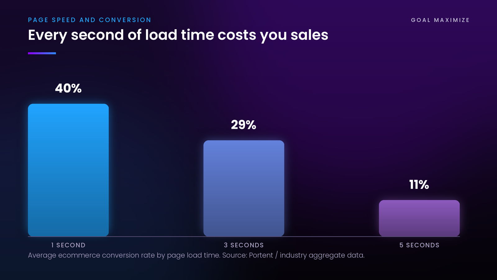
A gorgeous page that takes 5 seconds to load has already lost a chunk of its audience before anyone sees the design at all. Portent looked at over 100 million pageviews across ecommerce sites and found the ones loading in 1 second converted at roughly 3 times the rate of sites loading in 5 seconds. On mobile it’s worse. Google’s own research has found that a majority of mobile visits get abandoned once load time crosses 3 seconds.
This rarely comes down to one big fix. It’s usually a stack of smaller ones:
| What’s slowing things down | What usually fixes it |
|---|---|
| Oversized, uncompressed images | Compression, modern formats, lazy loading below the fold |
| Scripts loading before content renders | Deferring or async loading anything that isn’t critical to the first paint |
| Heavy theme or bloated hosting | Caching, a CDN, and trimming plugins that aren’t earning their keep |
We fold speed work into the same conversation as visual design rather than handing it off as a separate technical task, because it is one. That’s part of what’s covered in our website design and development guide, where the two get treated as one project instead of design and performance living in separate silos with separate deadlines.
Your form is probably longer than it needs to be
Forms are where good intentions go to die. Every field you add is a small ask, and small asks add up faster than most people expect. HubSpot looked at data from 40,000 customer forms and found that cutting fields from 4 to 3 lifted conversions by nearly 50%. In some tests, dropping a single unnecessary field produced almost the same bump on its own.
Fewer fields isn’t a rule that applies everywhere, though. If someone’s already motivated, say, they’re requesting a demo after reading 3 pages of your site, trimming the form too aggressively can end up hurting lead quality instead of helping conversion. The better question is whether you need that piece of information right now, or whether it can wait for a follow-up call or email.
A handful of things tend to hold up regardless of industry. Size input fields to match the expected answer; a 5-digit ZIP code field doesn’t need to stretch across the whole screen. Validate inline so people catch mistakes before hitting submit, not after. Use specific button copy (“Get My Free Quote”) instead of something generic like “Submit,” which tells a visitor nothing about what happens next. And if the form has to be long, break it into steps. Case studies on multi-step forms have shown completion rate gains of 30% to 60%, mostly because people don’t see the full scope of what they’re signing up for all at once.
This matters even more at checkout. Every extra step between “add to cart” and “order confirmed” is another chance for someone to change their mind. It’s a big enough piece of the puzzle that we treat checkout flow as its own discipline inside ecommerce web development, separate from general page layout work.
Design for the phone in someone’s hand, not the monitor on your desk
About 70% of online shoppers now buy from a phone, and that number keeps climbing. A lot of business sites still get designed on a big desktop monitor first, with mobile treated as an afterthought that gets squeezed into a narrower frame at the end. You can usually tell: cramped buttons, text that needs pinching to read, forms that are genuinely uncomfortable to fill out with a thumb.
Designing mobile first flips that order. You start with the smallest, most constrained screen, decide what actually earns a place on it, then build outward from there. It forces you to cut things that were only ever there because there was room for them, not because anyone needed them.
A few things worth checking on your own site right now: are buttons big enough to tap accurately without hitting the wrong one next to it? Does your main call to action show up without scrolling on a normal phone screen? Do your forms bring up the right keyboard- a number pad for phone fields, an email keyboard for email fields? And does the site actually load fine on a mid-range connection, not just the office WiFi everyone tests on and forgets isn’t representative? Your CMS plays a bigger role here than people expect too. A site built on solid CMS development makes responsive fixes straightforward. One held together by 15 plugins on top of a rigid page builder makes every mobile tweak a small fight.
Answer the doubt before the visitor has to ask it
Every visitor is quietly running a risk calculation before they convert. Is this company legitimate? Will the product actually work? Is my card information safe here? Trust signals exist to answer those questions before anyone has to type them into a search bar and go looking elsewhere.
Where you put them matters more than how many you have. A wall of client logos at the bottom of the homepage does less work than a single, specific testimonial sitting right next to the button you actually want clicked. What tends to work: testimonials with a real name and result attached instead of vague praise, security badges near the payment fields instead of buried in a footer nobody scrolls to, guarantees stated plainly on the page instead of hidden in a terms document, and client logos placed near the decision point rather than off on an about page most visitors never open. The goal isn’t to pile on proof. It’s to answer the specific doubt someone’s feeling at that exact moment.
Navigation people can actually use without thinking about it
Confusing navigation is a quiet problem because nobody complains about it. People don’t email you to say they couldn’t find your pricing page. They just leave, and you never find out why. Good navigation keeps the main categories limited and visible, puts search somewhere obvious on content-heavy sites, and gets someone from the homepage to any service page in 2 or 3 clicks, not 6.
It helps to think of navigation as part of the conversion path, not just a menu bar sitting at the top. Every page should point somewhere: a related article, a service page, a next logical step. Pages that just end, no link out, no obvious action, are one of the most common issues we find when auditing a client’s full website design and development setup.
Breadcrumbs are worth mentioning specifically. On any site with more than 2 levels of pages, breadcrumbs give people a visual sense of where they are and an easy way to step back up a level instead of hitting the browser’s back button and losing their place. It’s a small thing, but it keeps confused visitors on the site instead of off it, and it happens to help search engines understand your site structure too. Search functionality matters just as much on catalog or content-heavy sites. If someone can’t find a specific page in a few seconds, they’ll usually assume it doesn’t exist rather than assume they missed it.
Accessible sites tend to convert better, not just avoid lawsuits
Accessibility usually gets framed as a legal checkbox, something you handle to avoid a complaint. It’s also, separately, a conversion issue. Low contrast text, tiny fonts, and forms that only work with a mouse don’t just create risk; they create friction for a real slice of your visitors: older users, people checking their phone outdoors in bright sunlight, anyone with a screen that isn’t perfectly calibrated.
A handful of basics cover most of it. Keep contrast between text and background at least at a 4.5:1 ratio for body copy. Give every image real, descriptive alt text, which happens to help your SEO at the same time. Make sure forms can be completed with a keyboard alone. Keep body text at 16px or larger on mobile so nobody’s forced to zoom in just to read a paragraph. None of this requires giving up visual polish. Some of the highest-converting sites in competitive industries are also the most accessible ones, because clarity helps everyone, not just the people who technically need it.
What it looks like when all of this comes together
Here’s a version of the story we opened with, the kind we see across service businesses fairly often. Strong offer, decent paid traffic, conversion rate stuck under 1%. An audit usually turns up the same handful of culprits: a hero section arguing with itself over 3 competing calls to action, a contact form with 8 fields, a 4.5-second mobile load time, and a navigation menu with 12 items nobody asked for.
The fix is rarely a full redesign. It’s usually a short list of specific changes:
| Before | After |
|---|---|
| 3 competing calls to action above the fold | 1 primary call to action with specific button copy |
| 8-field contact form | 3 fields, with detail gathered later on a call |
| 4.5-second mobile load time | Under 2 seconds after image and script cleanup |
| 12-item navigation menu | 5 core categories with a clear path to each service |
None of these changes is dramatic on its own. Put together, they stop fighting each other, and that’s usually when a redesign starts producing results that look bigger than the amount of work involved.
Mistakes we see over and over
| Mistake | Why it costs you |
|---|---|
| Autoplay video or a pop-up the moment someone lands | You’re interrupting before they’ve decided the page is worth their time |
| Generic stock photography | Reads as impersonal and dents trust more than people expect |
| Vague button copy like “Learn More” or “Submit” | Gives no reason to expect anything from clicking it |
| Buttons that look different from page to page | Makes people relearn what’s clickable every time they land somewhere new |
| No visible phone number or address | Reads as a company with nothing to be accountable to, especially for bigger purchases |
How to check your own site without hiring anyone yet
You don’t need a full redesign to start improving conversion. A quick audit usually goes something like this. Map out the exact path a visitor takes from landing page to completed action, then walk it yourself. Check load speed on an actual phone over a normal connection, not the WiFi in your office. Count how many calls to action are fighting for attention above the fold, and if it’s more than 1, cut it down. Go through your form field by field and ask honestly whether you need each one right now. Hand the site to someone unfamiliar with it and time how long it takes them to find your main service page (10 seconds is a reasonable bar). And track the numbers that actually matter: bounce rate, form completion, time to first interaction, rather than just watching pageviews climb. We go into more detail on which numbers correlate with revenue in our piece on digital marketing KPIs every business owner should track.
Do this every few months, not once and done. What converted well a year ago can quietly stop working as devices change and visitor expectations shift with them.
A few questions we get asked a lot
Is UI design the same thing as UX design?
Not quite, though they’re closely tied together. UI is the visual layer: colors, buttons, spacing, fonts. UX is the whole experience of using the site, whether someone can complete a task without getting frustrated along the way. You need both. A gorgeous site with a confusing checkout still loses sales, and a smooth, logical flow wrapped in a dated design loses sales too, just for a different reason.
How fast will I see results from changes like these?
Some things move quickly. Form simplification and clearer button copy tend to show up in the numbers within days, since they remove actual steps from the process. Bigger structural changes, a navigation overhaul or a page rebuild, usually need 2 to 4 weeks of traffic before the results are reliable, longer if your site doesn’t get much traffic to begin with.
Do I really need to redesign the whole site?
Almost never, at least not right away. Most conversion problems trace back to a short list: slow load times, unclear calls to action, forms that ask too much, or navigation that leaves people guessing. Fixing those tends to produce a bigger return than a full visual overhaul, and it’s a lot less risky than rebuilding a site that might already be ranking decently in search.
Does any of this actually affect SEO, or just conversion?
Both, and they’re more connected than people assume. Page speed, mobile usability, and how quickly people leave a page are all things search engines pay attention to now. A slow, frustrating page tends to underperform in rankings even if the keyword targeting is spot on. Good UX and good SEO aren’t really 2 separate projects.
The short version
UI and UX aren’t the finishing touches you add once the marketing strategy is locked in. They’re the thing every other marketing effort has to pass through to actually turn into a sale. A visitor who can’t find your button, waits too long for a page to load, or gives up halfway through a bloated form wasn’t lost because of your offer. They were lost because of friction that was completely fixable.
If your traffic looks fine but the sales don’t match it, the design layer is usually where the gap is hiding. We can run a full UI/UX audit on your site and show you exactly where people are dropping off, with real data behind it instead of guesswork. Get in touch with Goal Maximize, and let’s turn the traffic you already have into actual customers.

**Shalini Thakur** is an SEO Specialist at Goal Maximize with 9+ years of experience in technical SEO, content strategy, and AI-powered search optimization. Specializes in data-driven SEO strategies, website optimization, content development, and adapting websites to the evolving AI-powered search landscape.